Wispr Flow — Warm Serif Voice AI
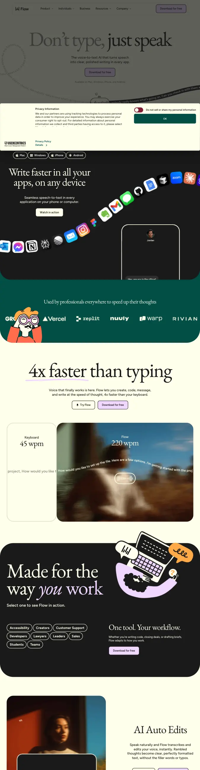
Warm Playful DTCCream-and-black serif SaaS that mixes hand-drawn mascots with lifestyle photography for a warm, human feel.
- Mood
- Warm, human, confident-but-approachable — a productivity tool that feels handcrafted rather than corporate.
- Colors
- Cream base #F5F1E4, near-black sections #121212/#161512, deep teal proof band #1C6B5A, soft lavender accent #C9BFFA, warm coral-orange CTA #F2703C.
- Type
- An elegant serif display (like GT Sectra or Tiempos) set large and loose for headlines, paired with a clean grotesque (Inter-like) for nav, body copy, and UI labels.
- Layout
- Full-bleed alternating sections — dark icon-collage hero, cream feature blocks, teal logo/proof band, black feature block — each with generous vertical padding; pill-shaped buttons, rounded photo cards, an orbiting icon halo around a central phone mockup.
- Motion
- App icons arc/orbit gently around a central device mockup; soft crossfades between sections; nothing aggressive, all understated and smooth.
- Texture
- Rounded corners throughout, soft drop shadows on photo cards, hand-drawn line-art mascot illustrations mixed with real lifestyle photography, subtle blur/motion-streak imagery.
- Imagery
- Generate: warm illustrated line-art mascots/characters, soft blurred-motion lifestyle photography (person mid-conversation or typing), and an orbiting app-icon collage around a phone mockup. Tool: kie-ai GPT-Image or nanobanana for illustrated mascots and icon collage; Pexels for lifestyle photography.
- Don't
- No sharp corners, no cold corporate blue, no dense data/UI screenshots dominating the page, no harsh drop shadows.
Use in a session
wisprflow
Tell Claude: build [my thing] using swipe ref wisprflow
Full recreation prompt
Recreate a landing page in the "Wispr Flow — Warm Serif Voice AI" style (Warm Playful DTC). This is a VIBE / STYLE-TRANSFER task, not a clone: apply the design DNA below to MY content and section structure, do not copy the reference's copy or exact layout.

Design DNA:
- Mood: Warm, human, confident-but-approachable — a productivity tool that feels handcrafted rather than corporate.
- Colors: Cream base #F5F1E4, near-black sections #121212/#161512, deep teal proof band #1C6B5A, soft lavender accent #C9BFFA, warm coral-orange CTA #F2703C.
- Typography: An elegant serif display (like GT Sectra or Tiempos) set large and loose for headlines, paired with a clean grotesque (Inter-like) for nav, body copy, and UI labels.
- Layout: Full-bleed alternating sections — dark icon-collage hero, cream feature blocks, teal logo/proof band, black feature block — each with generous vertical padding; pill-shaped buttons, rounded photo cards, an orbiting icon halo around a central phone mockup.
- Motion: App icons arc/orbit gently around a central device mockup; soft crossfades between sections; nothing aggressive, all understated and smooth.
- Texture: Rounded corners throughout, soft drop shadows on photo cards, hand-drawn line-art mascot illustrations mixed with real lifestyle photography, subtle blur/motion-streak imagery.
- Avoid: No sharp corners, no cold corporate blue, no dense data/UI screenshots dominating the page, no harsh drop shadows.

Imagery (generate real assets, do not use placeholders): Generate: warm illustrated line-art mascots/characters, soft blurred-motion lifestyle photography (person mid-conversation or typing), and an orbiting app-icon collage around a phone mockup. Tool: kie-ai GPT-Image or nanobanana for illustrated mascots and icon collage; Pexels for lifestyle photography.

Reference exemplar: https://wisprflow.ai. Build the page around the content I give you next, faithfully channeling this aesthetic, and generate the matching imagery described above.