Tally — Minimal Doc Form
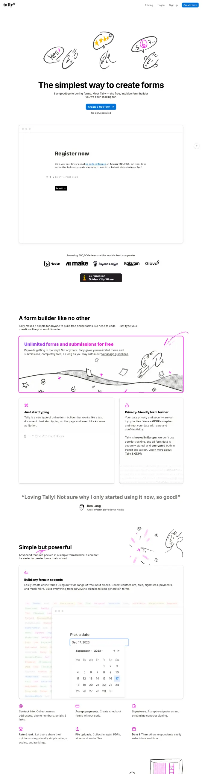
Conversational FormNotion-clean form building: pure black type on white, a single blue CTA, and hand-drawn doodles that keep an otherwise stark page warm.
- Mood
- Effortless, honest, indie-friendly. Forms as plain documents you just start typing into. Minimal chrome, zero intimidation, a touch of hand-drawn play.
- Colors
- White background, near-black text, one saturated blue for the primary button and inline accents. Doodles in black with occasional pink/yellow/purple pops. Otherwise monochrome.
- Type
- Bold heavy sans display headline ('The simplest way to create forms'), regular sans body, document-like question styling. Tight, confident, no serifs.
- Layout
- FLOW-FIRST. Document-style form: each question is a typed line with a minimal underline/box input, stacked vertically like a Notion doc, one blue submit at the end — no visual step-gating, you scroll the page. Marketing homepage centers a doodle cluster over a giant headline, subhead, single blue CTA, and 'No signup required' reassurance. Slim top nav, floating help bubble.
- Motion
- Minimal — hover states on the button, doodles static or with a tiny wiggle, smooth scroll. Restraint is the point.
- Texture
- Flat white paper, hand-drawn marker doodles as the only ornament, thin dividers, lots of air.
- Imagery
- Generate: rough black marker doodles (squiggles, arrows, stars, little faces) scattered around the headline, a clean document-style form block (typed questions, underline inputs, one blue submit button), and a tiny circular help bubble bottom-right. Tool: nanobanana for the marker doodles; build the form/document UI in code.
- Don't
- No gradients, no stacked drop shadows, no heavy illustration, no more than one accent color, no dark mode. Keep it paper-plain with doodle warmth.
Use in a session
tally-forms
Tell Claude: build [my thing] using swipe ref tally-forms
Full recreation prompt
Recreate a landing page in the "Tally — Minimal Doc Form" style (Conversational Form). This is a VIBE / STYLE-TRANSFER task, not a clone: apply the design DNA below to MY content and section structure, do not copy the reference's copy or exact layout. For this archetype the LAYOUT field carries the funnel/quiz FLOW — preserve that conversion structure, not just the look.

Design DNA:
- Mood: Effortless, honest, indie-friendly. Forms as plain documents you just start typing into. Minimal chrome, zero intimidation, a touch of hand-drawn play.
- Colors: White background, near-black text, one saturated blue for the primary button and inline accents. Doodles in black with occasional pink/yellow/purple pops. Otherwise monochrome.
- Typography: Bold heavy sans display headline ('The simplest way to create forms'), regular sans body, document-like question styling. Tight, confident, no serifs.
- Layout: FLOW-FIRST. Document-style form: each question is a typed line with a minimal underline/box input, stacked vertically like a Notion doc, one blue submit at the end — no visual step-gating, you scroll the page. Marketing homepage centers a doodle cluster over a giant headline, subhead, single blue CTA, and 'No signup required' reassurance. Slim top nav, floating help bubble.
- Motion: Minimal — hover states on the button, doodles static or with a tiny wiggle, smooth scroll. Restraint is the point.
- Texture: Flat white paper, hand-drawn marker doodles as the only ornament, thin dividers, lots of air.
- Avoid: No gradients, no stacked drop shadows, no heavy illustration, no more than one accent color, no dark mode. Keep it paper-plain with doodle warmth.

Imagery (generate real assets, do not use placeholders): Generate: rough black marker doodles (squiggles, arrows, stars, little faces) scattered around the headline, a clean document-style form block (typed questions, underline inputs, one blue submit button), and a tiny circular help bubble bottom-right. Tool: nanobanana for the marker doodles; build the form/document UI in code.

Reference exemplar: https://tally.so. Build the funnel around the content I give you next, faithfully channeling this aesthetic and this flow, and generate the matching imagery described above.