Camelo — Clean Blue Workforce SaaS
Clean CorporateBright white B2B SaaS page anchored by one confident blue, colorful calendar-UI device mockups, and a dense trust-logo wall.
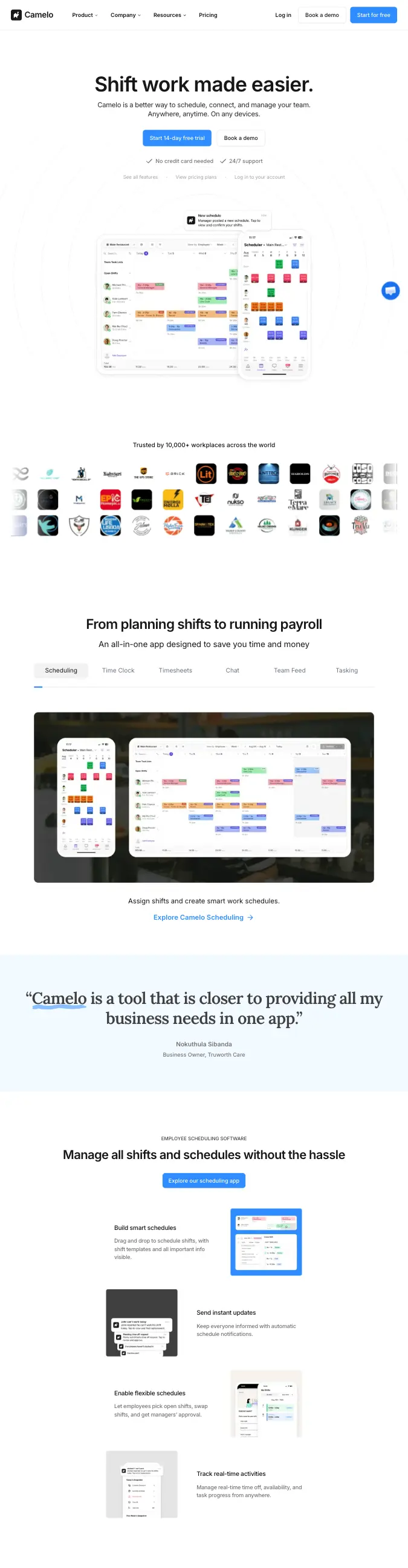
- Mood
- Clean, trustworthy, no-nonsense B2B SaaS — built for operations managers, not designers. Confident simplicity over cleverness.
- Colors
- Pure white background (#FFFFFF), single strong blue accent for all CTAs and links (#2E5BFF), light blue testimonial-band background (#EAF1FE), near-black headline text (#111111), muted gray body copy (#5B5F66). Product screenshots carry their own bright multi-color shift blocks (pink, orange, green, yellow) as the only saturated color departure.
- Type
- A bold, plain geometric sans (Inter or similar) for headlines with tight tracking, regular weight for body copy, small uppercase tracked-out eyebrow labels above section headers.
- Layout
- Centered hero headline plus subhead plus dual CTA buttons (solid blue primary, white outline secondary), trust badges row, then a large tablet+phone device mockup floating over a dark photographic panel. Below: a tabbed feature switcher, a dense multi-row trust-logo grid, a full-width light-blue quote/testimonial band, then repeating alternating icon-mockup-plus-copy feature rows.
- Motion
- Straightforward fade/slide-up on scroll for each feature row, tab-switch content crossfades, no parallax or heavy scroll-jacking — feels like a functional product site, not an art piece.
- Texture
- Flat color fields throughout, soft drop shadow under the floating device mockup, thin card borders around logo tiles, rounded-corner UI screenshots — no gradients, no grain, no glow.
- Imagery
- Generate: tablet and phone device mockups showing a colorful color-coded shift-scheduling calendar UI (pink, orange, green, blue shift blocks on a white grid), plus a dark photographic backdrop panel behind the device mockup for contrast, and a grid of ~24 monochrome client-logo marks for the trust wall. Tool: kie-ai GPT-Image or Seedream for the device-mockup UI screens; nanobanana for the logo grid.
- Don't
- No dark mode, no serif type, no gradient meshes or glassmorphism, no hand-drawn illustration — keep it flat, blue-and-white, and screenshot-driven.
Use in a session
camelo
Tell Claude: build [my thing] using swipe ref camelo
Full recreation prompt
Recreate a landing page in the "Camelo — Clean Blue Workforce SaaS" style (Clean Corporate). This is a VIBE / STYLE-TRANSFER task, not a clone: apply the design DNA below to MY content and section structure, do not copy the reference's copy or exact layout.

Design DNA:
- Mood: Clean, trustworthy, no-nonsense B2B SaaS — built for operations managers, not designers. Confident simplicity over cleverness.
- Colors: Pure white background (#FFFFFF), single strong blue accent for all CTAs and links (#2E5BFF), light blue testimonial-band background (#EAF1FE), near-black headline text (#111111), muted gray body copy (#5B5F66). Product screenshots carry their own bright multi-color shift blocks (pink, orange, green, yellow) as the only saturated color departure.
- Typography: A bold, plain geometric sans (Inter or similar) for headlines with tight tracking, regular weight for body copy, small uppercase tracked-out eyebrow labels above section headers.
- Layout: Centered hero headline plus subhead plus dual CTA buttons (solid blue primary, white outline secondary), trust badges row, then a large tablet+phone device mockup floating over a dark photographic panel. Below: a tabbed feature switcher, a dense multi-row trust-logo grid, a full-width light-blue quote/testimonial band, then repeating alternating icon-mockup-plus-copy feature rows.
- Motion: Straightforward fade/slide-up on scroll for each feature row, tab-switch content crossfades, no parallax or heavy scroll-jacking — feels like a functional product site, not an art piece.
- Texture: Flat color fields throughout, soft drop shadow under the floating device mockup, thin card borders around logo tiles, rounded-corner UI screenshots — no gradients, no grain, no glow.
- Avoid: No dark mode, no serif type, no gradient meshes or glassmorphism, no hand-drawn illustration — keep it flat, blue-and-white, and screenshot-driven.

Imagery (generate real assets, do not use placeholders): Generate: tablet and phone device mockups showing a colorful color-coded shift-scheduling calendar UI (pink, orange, green, blue shift blocks on a white grid), plus a dark photographic backdrop panel behind the device mockup for contrast, and a grid of ~24 monochrome client-logo marks for the trust wall. Tool: kie-ai GPT-Image or Seedream for the device-mockup UI screens; nanobanana for the logo grid.

Reference exemplar: https://camelohq.com/. Build the page around the content I give you next, faithfully channeling this aesthetic, and generate the matching imagery described above.